
My Pilot pens arrived in the post yesterday, two of which I ordered specifically for their nibs. I put the Plumix’s medium italic nib in the Metropolitan, the Metropolitan’s medium round nib in the 78g, the 78g’s broad stub nib (which seems to be more of a medium italic) in the Prera, and the Prera’s fine round nib in the Plumix.
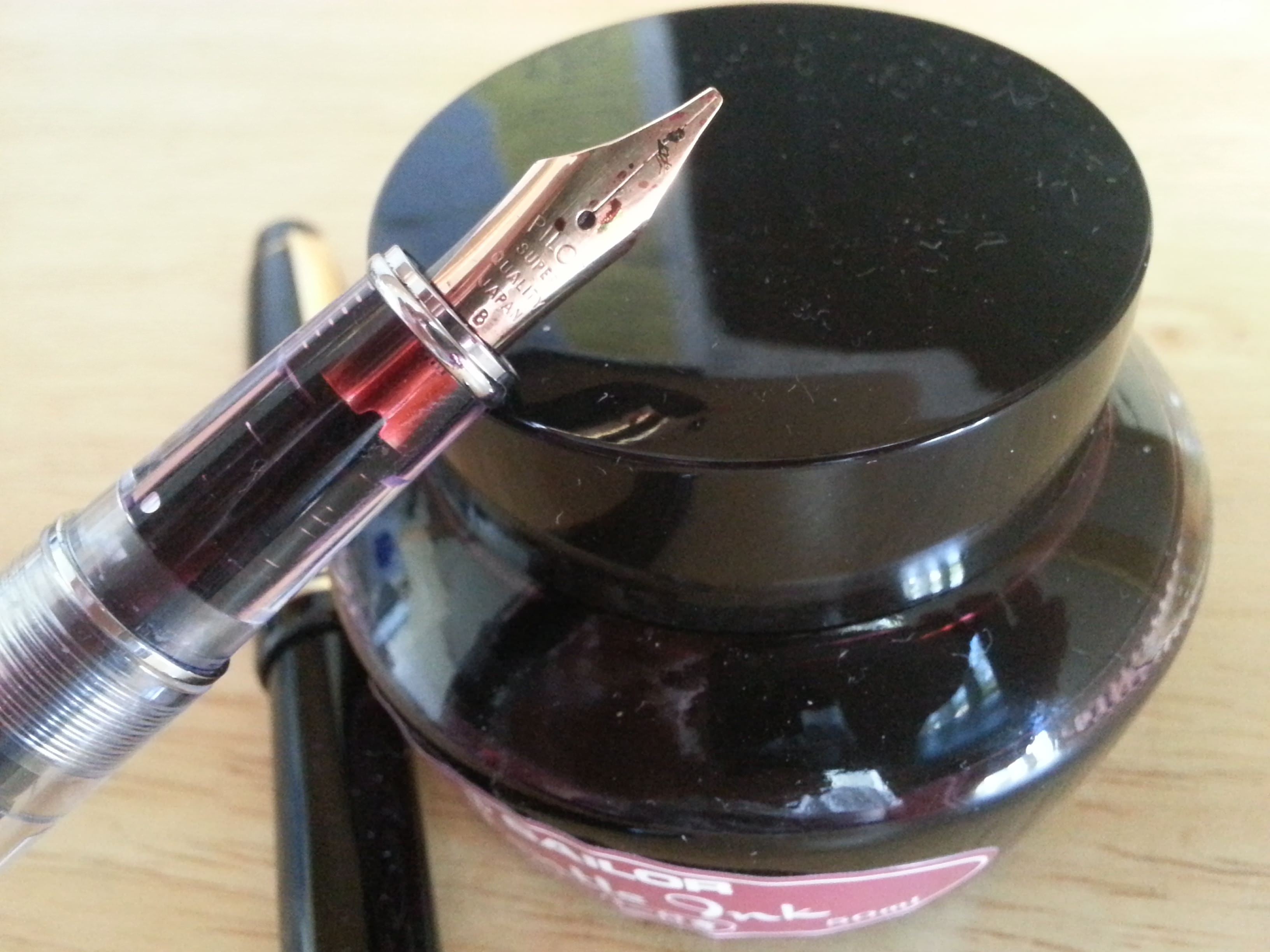
They all seem to perform well enough, but I don’t like the way the 78g’s 22k gold-plated nib looks on my Prera demonstrator, and the 78g is pretty meh. Before the Pilot Metropolitan came out, the 78g was probably a great deal. It’s still a pretty good value, but the construction and feel of the Metropolitan, which is only about $3 more, is so much better. The 78g does have one more nib option (stub) than the Metropolitan, which currently only has options for M or F, but the Metropolitan has a lot more barrel options.
I am really happy with the Plumix. I put the original converter from the Metropolitan, which I replaced with a CON-20, in the Plumix in addition to trading out the nib for a fine, as I mentioned earlier. The pen writes effortlessly with Noodler’s 54th Massachusetts. Some people think the Plumix is ugly, but I kinda like it. The squid-thing it has going on is what I imagine Lovecraft would create if Lovecraft did sub-$10 fountain pens.
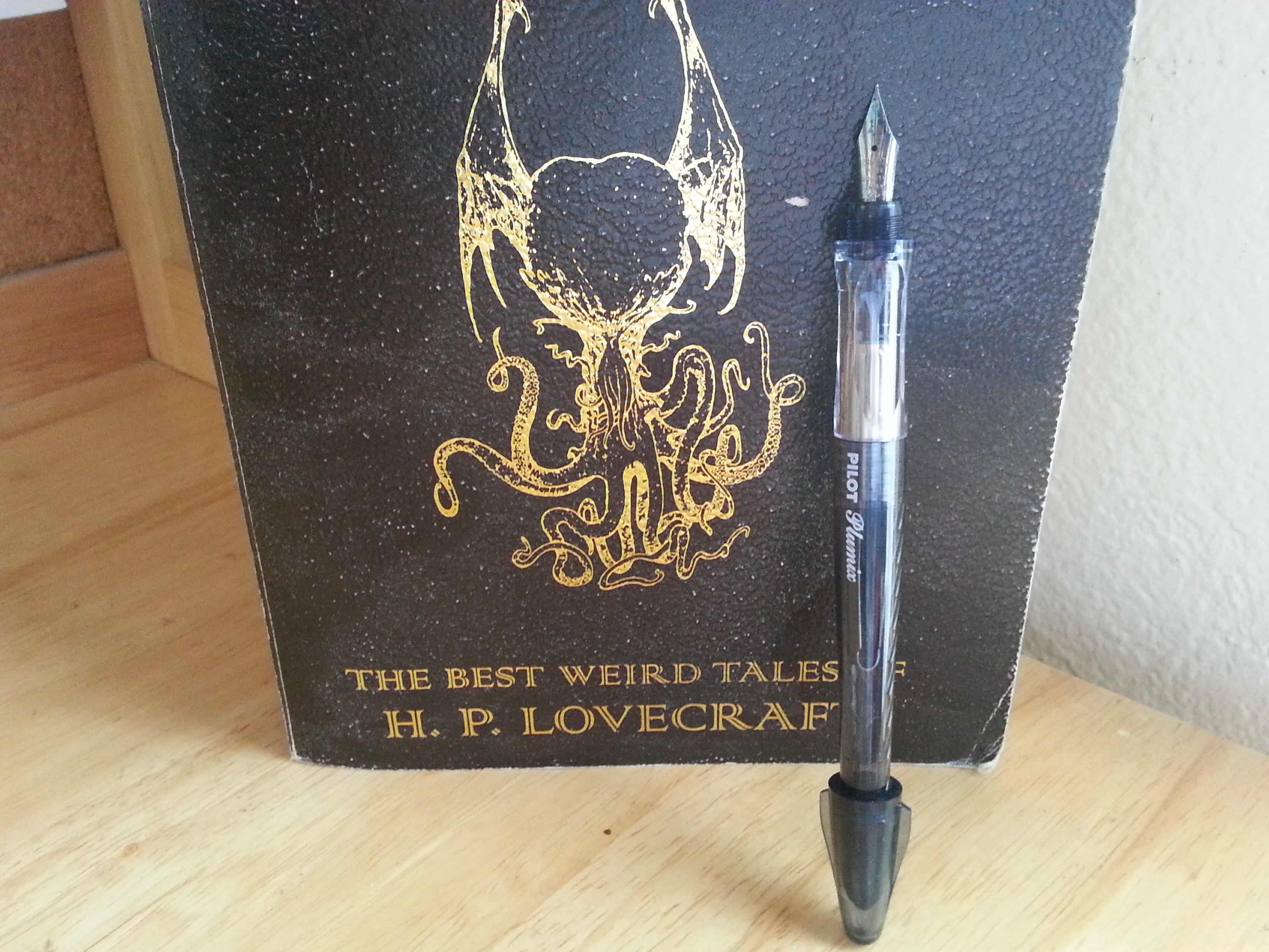
I’m so satisfied with the Plumix that I plan to order two more. One of the italic nibs I’ll use in my Pilot Knight, and the other I’ll probably swap with the B stub nib currently in the Prera. Then I’ll fill the purple one up with some J. Herbin’s Poussiere de Lune to complement that Lovecraftian feel.
